“A picture is worth a thousand words”
-Fred R. Barnard
Data visualization is a visual (or graphic) representation of data to find useful insights (i.e. trends and patterns) in the data and making the process of data analysis easier and simpler.
Aim of the data visualization is to make a quick and clear understanding of data in the first glance and make it visually presentable to comprehend the information.
In Python, several comprehensive libraries are available for creating high quality, attractive, interactive, and informative statistical graphics (2D and 3D).
Some popular data visualization libraries available in Python
- Matplotlib is one such popular visualization library available which allows us to create high-quality graphics with a range of graphs such as scatter plots, line charts, bar charts, histograms, and pie charts.
- Seaborn is another of Python’s data visualization library built on top of Matplotlib, which have a high-level interface with attractive designs. Moreover, it reduces the lines of code required to produce the same result as in Matplotlib.
- Pandas is another great library available in Python for data analysis (data manipulation, time-series analysis, integrating indexing of data, etc.). Pandas Visualization (built on top of Matplotlib) is a tool of Pandas library that allows us to create a visual representation of data frames (data aligned in tabular form of columns and rows) and series (one-dimensional labeled array capable of holding data of any type) much quicker and easier way.
- Plotly library is used for creating interactive and multidimensional plots making the process of data analysis easier by providing a better visualization for the data.
With this article, we will be able to visualize the data in different forms by learning how to plot data in different Python libraries and understand where to use which one appropriately.
Note: We can use Google Colaboratory to avoid the process of installation of libraries. All the libraries can be used by simply importing them in the notebook.
Understanding the basics of Maplotlib
 |
| (Image by Author) Elements of Graph |
- Figure: The entire area where everything is being drawn. It can contain multiple plots with axes, legends, a range of axes, grid, plot-title, etc.
- Axes: The area under the figure where the plot is being constructed (or the area your plot appears in) is known as axes. There can be multiple axes in a single figure.
- Axis: This is the number line present in the graph which represents the range of values for the plot (X-axis and Y-axis as mentioned in the above figure). There can be more than two axis in the graph in the case of a multi-dimensional graph.
- Plot title: The title is positioned in the center above the axes, giving an overview of the plot.
Importing the dataset
We can import this data set in two ways:
1. Using Scikit-learn library:

Without downloading the .csv file we can directly import the data set in the workspace using sci-kit learn library available in python.
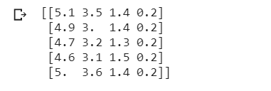 |
| (Image by Author) First five heads in the data set |
2. Using Pandas library:
.csv format of the dataset we can import the data in our workspace. These, are the first five elements in the iris dataset: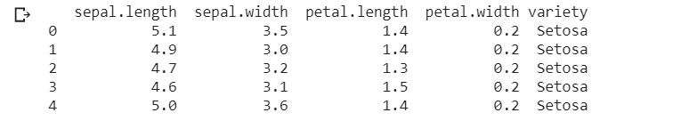 |
| (Image by Author) First five heads in the data set |
Getting started with Matplotlib
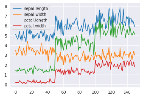
Line plots
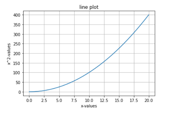
Line plot or line chart represents the data in a series (in continuation) showing the frequency of data along with the number line. It can be used to compare numerical sets of values. This is one of the most simple graphs that we can make using python.
numpy linspace() function we will generate data-points and store them in variable x and calculate the square of values of x and store them in another variable y . We will use plt.plot() function to plot the graph and plt.show() to display the graph.
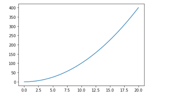 |
| (Image by Author) Line chart of y=x² |
We can add some more functions to our plot to make it much easier to interpret.
- To add a label:
x-axis labelandy-axis labelwe will useplt.xlabel()andplt.ylabel()functions respectively. - We can also give a title to our plot using the
plt.title()function. - A grid in the plot can simply be applied by calling
plt.grid(True)function (makes data easier to interpret).
With the addition of these functions, the graph becomes much more readable and easier to analyze.
 |
| (Image by Author) Line chart of y=x² |
We can add more than one line to our plot and make them distinguishable by using different colors and some other features:
In the above code, we have added another variable z=x**3 (z=x³) and changed the style and color of the line.
To change the color of a line in the line plot we have to add color='' parameter in plt.plot() function.
To change the style of a line in the line plot we have to add linestyle=’’ parameter in plt.plot() function (or simply we can add ‘*’ or ‘- -’, etcetera).
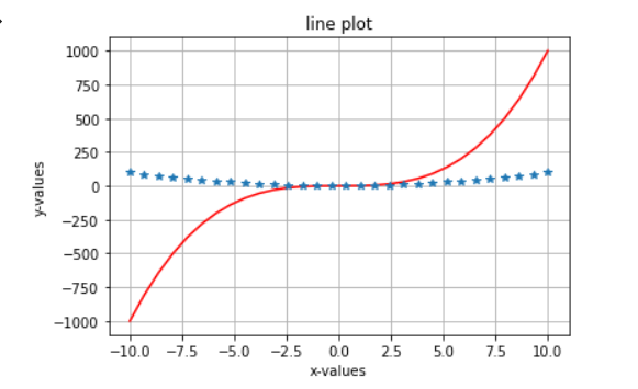 |
| (Image by Author) Line chart of y=x² and z=x³ |
This makes the extraction of information and comparison of data variables easier.
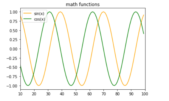
Similarly, we can create plots for mathematical functions as well:
Here, we have created a plot for sin(x) and cos(x) .
We can adjust the limit of axes by using the functions plt.xlim(lower_limit,upper_limit) for x-axis and plt.lim(lower_limit,upper_limit) for y-axis.
For further labeling of the plot, we can add legend with plt.legend() function, it will help to identify which line stands for which function.
Subplots
plt.subplots(num_rows,num_cols) function. Here the details of each subplot can be different.plt.sublots() function creates a figure and grid of subplots, in which we can define the number of columns and rows by passing an int value as the parameter. Moreover, we can also change the spacing between the sublopts by using the gridspec_kw={'hspace': , 'wspace': } argument. After that, by simply using the index number for the subplot we can easily plot the graphs.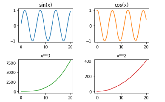 |
| (Image by Author) Four subplots in a single figure |
Scatter plots
This kind of plot uses ‘dots’ to represent the numerical data for different variables.
Scatter plots can be used to analyze how one variable affects the other variables. (We can use any number of variables we want to plot on the graph.)
We will use dataset_name.plot() function to create the graph and in parameters, we will apply the kind = 'scatter’ with a label for x-axis and y-axis . Check out the example mentioned below (iris dataset).
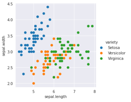
Here, we are comparing the petal length and petal width of different species of flowers present in the dataset.
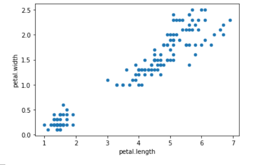 |
| (Image by Author) Iris dataset scatter plot |
But, here it would be very difficult for us to analyze and extract information from this plot because we cannot differentiate between classes present.
So now, we will try another approach which will solve our problem. In this method, we will use plt.scatter() to create a scatter plot.
To change the color of dots based on the species of flower, we can create a dictionary with storing the colors corresponding to the names of the species. By using the for loop we create a single scatter plot of three different species (each represented by a different color).
This plot created is way better than the previous one. The data of species became easier to distinguish and gives an overall clarity for an easier analysis of information.
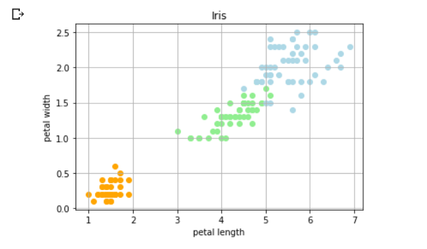 |
| (Image by Author) Iris dataset colored scatter plot |
Bar plots
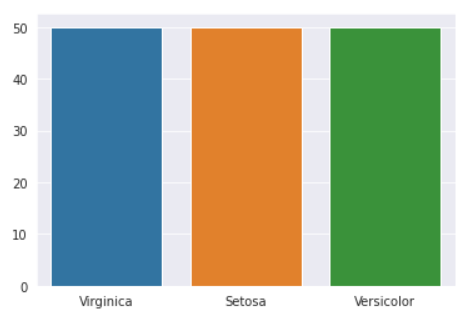
Bar graphs can be used to compare categorical data. We have to provide the frequency and the categories, we want to represent on the plot.
Here we are using the iris dataset, to compare the count of different species of flowers (however, they are equal to fifty). To find the count of each unique category in the dataset we are using the value_counts() function. The variable species and count in the following code store the name of each unique category ( .index function) and the frequency of each category ( .values function)
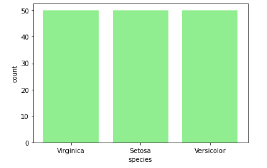 |
| (Image by Author) Count of different species of flowers in the iris dataset |
This is the most basic kind of bar graph, you can try some variations of this plot like multiple bar plots in the same figure, change the width of bars (using width=parameter) or create a stacked bar plot (using bottom parameter).
Box plots
Box plots help plot and compare the values by plotting the distribution of data based on the sample minimum, the lower quartile, the median, the upper quartile, and the sample maximum (known as the five-number summary). This can help us analyze the data to find the outliers and the variation in the data.
We have excluded the species column here since we are only comparing the petal length, petal width, sepal length, sepal width of all the flowers in the iris dataset. We create the box plot using the .boxplot() function.
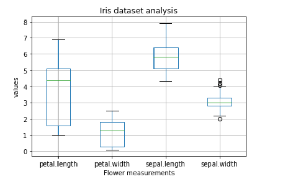 |
| (Image by Author) Box plot |
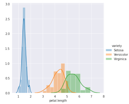
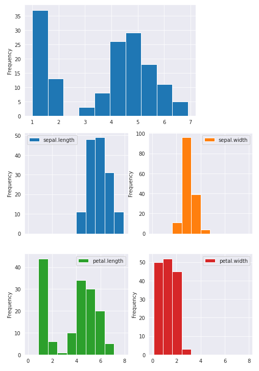
Histograms
Histograms are used for the representation of frequency distribution (or we can say probability distribution) of the data. We have to use the plt.hist() function to create the histogram plot and we can also define the bins for the plot (i.e. breaking down the entire range of values into a series of intervals and calculating the count of values falling in each interval).
Histograms are a special kind of bar graph.
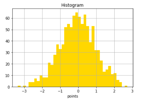 |
| (Image by Author) Histogram |
Error Bars
Error bar is an excellent tool to find out the statistical difference between the group of data by giving a visual representation of the variation in data. It helps to point the error and precision in the process of data analysis (and determine the quality of the model).
To plot the error bars, we have to use errorbar() function where x and y are data point locations, yerr and xerr define the size of the error bars (in this code we are only using yerr).
We can also change the style and color of the error bars by using fmt parameter (like we set the style to dots ’o’in this particular example), ecolor for changing the color of dots and color parameter for changing the color of vertical lines.
By adding loc = '' parameter in the plt.legend() function we can determine the position of the legend in the plot.
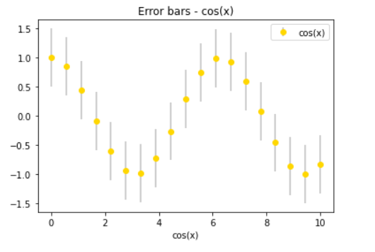 |
| (Image by Author) cos(x) error bar plot |
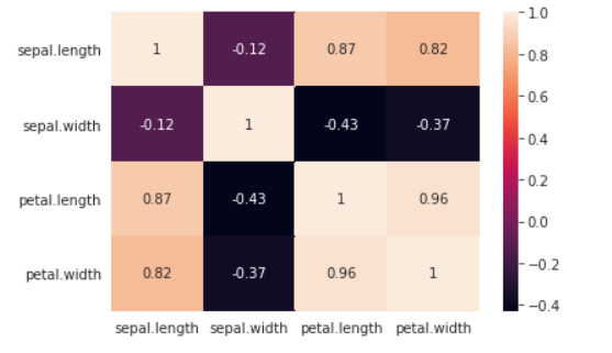
Heat maps
Heat maps are used to represent categorical data in the form of ‘color-coded image plot’ (values in the data are represented as colors) to find the correlation of the features in data (cluster analysis). With the help of heat maps, we can have a quick and deep analysis of the data visually.
.corr() is a panda’s data frame function used to find the correlation in the dataset. The Heat map is created by using the .imshow() function where we pass the correlation of dataset, cmap (for setting the style and color of the plot) as arguments. To add the colobar we use the .figure.colorbar() function. And finally to add annotations (the values you can see mentioned over the color blocks) we have used two for loops.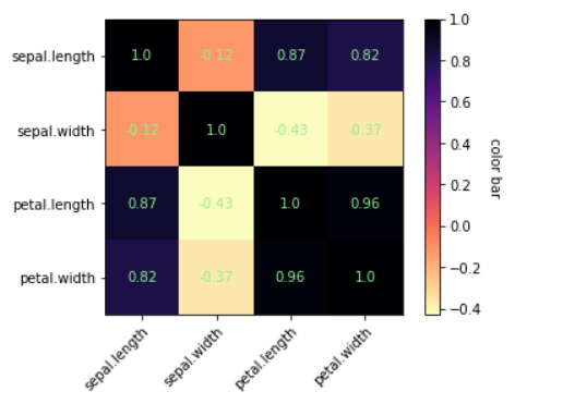 |
| (Image by Author) Iris dataset heatmap |
Pie charts
Pie charts are used to find the correlation (it can be percentage or proportion of data) between the composition of categories in the data where each slice represents a different category, giving the summary of whole data.To plot the pie chart we have to use the
plt.pie() function. To give a 3D effect to the plot we have used shadow = True parameter, explode parameter to show a category separately from the rest of the plot, and for displaying the percentage of each category we have to use autopct parameter. To make the circle proportionate we can use the plt.axis('equal') function.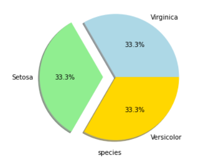 |
| (Image by Author) Pie chart matplotlib |
Seaborn
With the seaborn’s high-level interface and attractive designs, we can create amazing plots with better visualizations. Moreover, the lines of code required are reduced to a very great extent (as compared to matplotlib).Code for importing the library in the workplace:
Line plots
We can simply create the line plot in the seaborn library by using the sns.lineplot() function.
Here we can vary the color of grid/background using .set_style() function available in the library. And using sns.lineplot() function we can plot the line chart.
 |
| (Image by Author) Line chart using seaborn library |
Scatter Plot
With the seaborn library, we can create the scatter plot in just a single line of code!
Here, we have used FacetGrid() function (with which we can quickly explore our dataset) to create the plot in which we can define hue (i.e. colors for scatter dots) and .map function to define the graph type. (Alternative method for creating a scatter plot is using sns.scatterplot() )
 |
| (Image by Author) Scatter plot using seaborn library |
Bar plots
We can create a bar plot in the seaborn library by using sns.barplot() function.
 |
| (Image by Author) Bar plot using seaborn library |
Histogram
We can create a histogram in the seaborn library by using sns.distplot() function. We can also calculate probability distribution frequency (PDF), cumulative distribution frequency (CDF), and kernel density estimate (KDE) using this library for data analysis.
Seaborn gives some more features for data visualization than matplotlib.
 |
| (Image by Author) Histogram using seaborn library |
Heat maps
Seaborn is very efficient in creating heat maps by significantly reducing the lines of code to create the figure.
Multiple lines of code in matplotlib is reduced to just two lines!
 |
| (Image by Author) Heatmap using seaborn library |
Pair plots
This is a unique kind of plot available in the seaborn library. This plots a pairwise relationship in datasets (in a single figure). This is an amazing tool for the purpose of data analysis.

By using sns.pairplot() function we can create pair plots ( height is used to adjust the height of the plots).
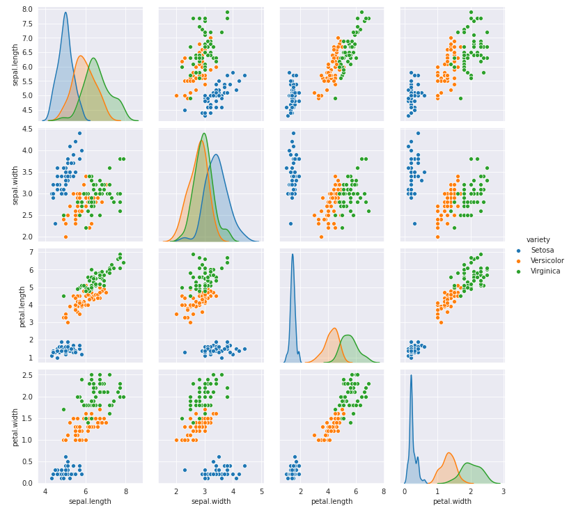 |
| (Image by Author) Pairplot using seaborn library |
Pandas Visualization
This library provides an easy way to plot graphs using pandas data frames and data structures. This library is also built on top of matplotlib thus requires fewer lines of code.
Histograms

It is very simple to create a histogram with this library, we simply have to use .plot.hist() function. We can also create subplots in the same figure by using subplots=True argument.
 |
| (Image by Author) Histogram using the pandas library |
Line plots
We can create line plots using this library by using .plot.line() function. Legends are also automatically added in this library.
 |
| (Image by Author) Line plots using the pandas library |
Plotly
With this library, we can create multidimensional interactive plots! This is easy to use library with a high-level interface. We can import this library by using the following code:
4D-plot (Iris dataset)
You try running this code on your own to check and interact with the plot.
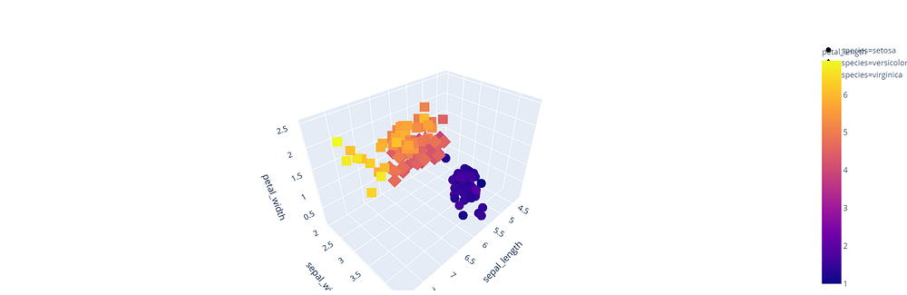 |
| (Image by Author) Interactive Multidimensional Plot |
Conclusion
I hope with this article you will be able to visualize the data using different libraries in python and start analyzing it.
For a better understanding of these concepts, I will recommend you try writing these codes on your once. Keep exploring, and I am sure you will discover new features along the way.
If you have any questions or comments, please post them in the comment section.
If you want to improve the way you code, check out our article:
https://patataeater.blogspot.com/2020/08/how-to-write-efficient-and-faster-code.html
Resources:
https://plotly.com/
https://matplotlib.org/
https://pandas.pydata.org/
https://seaborn.pydata.org/
Informative blog for python learner. Thanks for sharing.
ReplyDeletepython course london
Data visualization is the art of representing information graphically to make it easier to understand and extract insights. Python offers a rich ecosystem of libraries to create stunning and informative visualizations.
DeleteMachine Learning Final Year Projects
Key Python Libraries for Data Visualization
Matplotlib: The foundational library, providing a wide range of static plots.
Seaborn: Built on Matplotlib, offering a higher-level interface for attractive statistical graphics.
Plotly: Creates interactive and dynamic visualizations, including 3D plots.
Bokeh: Focuses on interactive visualizations, often used for web applications.
Altair: Declarative visualization library for concise and expressive code.
Common Plot Types
Line plots: For trends over time or continuous data.
Scatter plots: For visualizing relationships between two numerical variables.
Bar charts: For comparing categorical data.
Histograms: For visualizing data distribution.
python projects for final year students
Box plots: For summarizing data distribution, including quartiles and outliers.
Heatmaps: For visualizing relationships between two variables in a matrix format.
Geographic plots: For mapping data on geographic maps (using libraries like Folium).
Thanks for sharing all the information with us all.
ReplyDeleteData Science Online Training
Salesforce Online Training
Very nice Article, good to see the response from the user and writer. I’d really like to appreciate the efforts you get with writing this post. Thanks for sharing. To know more: https://www.ethans.co.in/course/python-training-in-pune/
ReplyDeleteNice article. I liked very much. All the information given by you are really helpful for my research. keep on posting your views.
ReplyDeletedata analytics course in delhi
This comment has been removed by the author.
ReplyDeleteMaking Machine Learning Awesome
ReplyDeleteThanks for sharing on Data Visualization Guide : Python, Well Explained
ReplyDeletePython Training in Pune
Thanks for sharing on Data Visualization Guide : Python, Well Explained
ReplyDeletePython Classes in Pune
Thanks for sharing this interesting blog, well explain about data visalization with Python.
ReplyDeletePython Classes in Pune
Choosing the right data visualization tool is very important for you to communicate your real-time information clearly. There are many complex visualizations like Scatter Plot, Sankey Diagram, Likert Chart & Pareto Chart but the Scatter Plot is the best to use when finding correlation between two variables.
ReplyDeleteRead more here:
https://blog.zumvu.com/scatter-plot-for-data-visualization/ .
Thanks for sharing this awesome post. Keep sharing more again soon.
ReplyDeletePython Course in Hyderabad
Nice Post , Thanks for the information.
ReplyDeletePlease click on the link below. Data visualization
Hi, I read your whole blog. This is very nice. Good to know about the career in qa automation is broad in future. We are also providing various Python Training, anyone interested can Python Training for making their career in this field .
ReplyDeleteThis post is so helpfull and informative.keep updating with more information...
ReplyDeletePython Courses In Mumbai
Python Course In Ahmedabad
Python Course In Kochi
Python Course In Trivandrum
Python Course In Kolkata
Nice Post , Thanks for the information.
ReplyDeletePlease click on the link below Data visualization
I loved your post.Much thanks again. Fantastic.
ReplyDeletesalesforce training
salesforce online training
I have found great and massive informatio
ReplyDeletePython Online Training In Hyderabad
Python Online Training
Excellent post. You have shared some wonderful tips. I completely agree with you that it is important for any blogger to help their visitors. Once your visitors find value in your content, they will come back for more What is the Python
ReplyDeleteThis comment has been removed by the author.
ReplyDeleteData Science Course in Gurgaon
ReplyDeleteThis comment has been removed by the author.
ReplyDeleteThank for your valuable information. visit our Data science course in gurgaon
ReplyDeleteTravelling can be stressful, but your airport transfer doesn't have to be! Book our reliable airport transfers Lisbon and experience a hassle-free journey from the airport to your destination. With our comfortable vehicles, experienced drivers, and punctual service, we guarantee a smooth ride to your hotel or any point in the city. Book now and travel with peace of mind!
ReplyDeleteThis comment has been removed by the author.
ReplyDeleteAPTRON's Python Training Course in Gurgaon and unlock the vast potential of this versatile programming language. Our trainers will guide you through the learning process, ensuring that you become proficient in Python and ready to tackle real-world challenges. Enroll today and take the first step towards a successful career in Python development!
ReplyDeleteAre you looking for the best Quantum Computing Training in Noida to gain a competitive edge in this transformative field? Look no further than APTRON! Our comprehensive Quantum Computing Training program in Noida is your gateway to unlocking the potential of quantum technology.
ReplyDeleteArticle is good, Very Nice. Data Science Classes in Nagpur, Data Science Course in Nagpur, Data Science Training in Nagpur from IT Education Centre.
ReplyDeleteNice blog Post.
ReplyDeletePython training in Pune
APTRON's Data Science Institute in Gurgaon stands as a beacon of excellence in the field of data science education. With a reputation for nurturing top-tier talent in the industry, APTRON's institute is a hub of innovation and learning.
ReplyDeleteThanks for sharing important information, keep sharing best java training institute in pune
ReplyDeletebest java classes in pune
As a fresh graduate, I’ve been going through Java tutorials like this to build my coding foundation. But I quickly realized that knowing how to test your own code is equally important for getting hired. That’s why I enrolled in software testing training for freshers in electronic city bangalore. It teaches both manual and automated testing alongside real-world projects. Combining Java knowledge from blogs like this with hands-on testing training has made me a much stronger candidate. Thanks for sharing these valuable resources!
ReplyDelete